Subtly Separating Character Emotions in REACHER
Reacher Season 1 involves its titular character having lots of chats in lots of generic houses and motels and warehouses and jail cells and cars and cafes . . . point is, a lot of places which don’t have ‘character’ or colour and texture, much of which is saved for fight scenes and Oscar’s suits.
A journeying director walking into this situation needs to be able to tweak the basics just enough, so the show can keep on budget and schedule but the visuals stay interesting. It’s a real bonus when these visuals can also demonstrate where the character is emotionally and in relation to other characters.
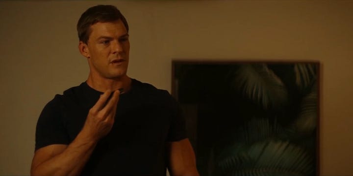
In 1.04 "In a Tree", Reacher and Roscoe are in a potentially-boring hotel room location doing two potentially-boring things; talking to a third person on the phone, and talking about what’s been said on the phone call.
Even typing the summary feels boring, but in action it works beautifully.
*for our purposes, I cut some of the middle conversation, especially in relation to the Reacher/third character discussion; much of which focuses on the third character*
Director Christine Moore (whose work I’ve praised elsewhere) uses lighting, blocking, and backdrop contrast to tease out different emotions between Reacher and Roscoe, and how they evolve through the scene.
The conversation starts in a basic shot-reverse-shot which when concentrating on Roscoe shows her looking up, and when on Reacher looks up at him. Like many Reacher shots, this partly serves to remind us of Reacher’s largeness, and partly has to be framed that way because of Reacher’s largeness.


As Reacher rejoins the phone call to talk to Molly, he and Roscoe move to opposite spots in the room; Reacher towards the bed, Roscoe towards the TV.
In doing this they cross sides of frame — Reacher from right to left, Roscoe from left to right — and from here on they are in ‘clean’ singles instead of dirty or OTS.
Note also, the shots move progressively closer through this section.


When Reacher says ‘the only person he’s ever felt small next to was his brother,’ he sits down; literally lowering himself along with the camera, and resetting what the background and framing of his singles will look like for the rest of the scene.
This is where the lighting starts getting really interesting.
Roscoe stays the same, lit warmly, looking at Reacher with warmth and concern and empathy.
Reacher is now positioned so the light of the bar is behind him, and his shots from here, whether low-angle or eye level, show it off.
While the hotel room is bathed in warm yellow light, and Roscoe and Reacher are both lit that way, Roscoe’s background stays a large square of yellow, while Reacher’s is a narrow white bulb, and a white wash underneath it.
As Roscoe moves to sit next to Reacher, you can see a wide of the whole room; without making a drastic or unrealistic colour difference, they’ve lit the right side yellower, while Reacher sits on white sheets and in slightly cooler light.
Even after they’ve come together again, Roscoe has some more of the square yellow behind her, and Reacher the white against the dark wall behind him.
A show with more surrealist or stylised lighting, a sci-fi show, etc., may have covered Reacher’s side of the room in blue or colder tones to really set the contrast, or at least had Reacher’s move ‘reset’ him into a stark white pool of light.
But despite its often unsubtle dialogue and ‘Reacher solves things by being large’ approach, Reacher’s design and lighting approach are quite minimal, naturalistic, and desaturated [ed. notes; see comments for more around ‘desaturated’ being a poor word choice for this]. Moore directs this exchange to stay within those show bounds, while still visually setting Reacher and Roscoe apart and mapping their emotional journeys.
Working quickly and within a show’s established vibe when coming in to do just one of eight episodes is a valuable skillset; being able to do it while putting in small, effective, character-centric spins on scenes is the next level of experience and mastery we can all study and learn from.


Interesting. I personally wouldn't describe this scene as 'desaturated' rather than effectively monochromatic. The skin tones are on point, if not quite warm, it's just there's a restricted colour palette due to the lighting.